Holi
The brand identity for Holi, a cycle-tracking app, written down in a brand guideline.
Brand Designer
Role
Background
Holi is a cycle-tracking app for women. You say how you feel in your own words. The app reads that next to your cycle and your wearable data and turns it into guidance for the day.
I designed Holi's identity and wrote the guideline that sets out how it's used.
Goals
Calm enough to trust
People log their cycle and symptoms every day, so the brand has to feel safe and steady.
Personal
Cycle tracking is personal. The identity should feel like a companion and look made by hand.
Ready for the product
Most of the brand lives inside the app, so colour and type had to hold up in charts and at small sizes.
The logo
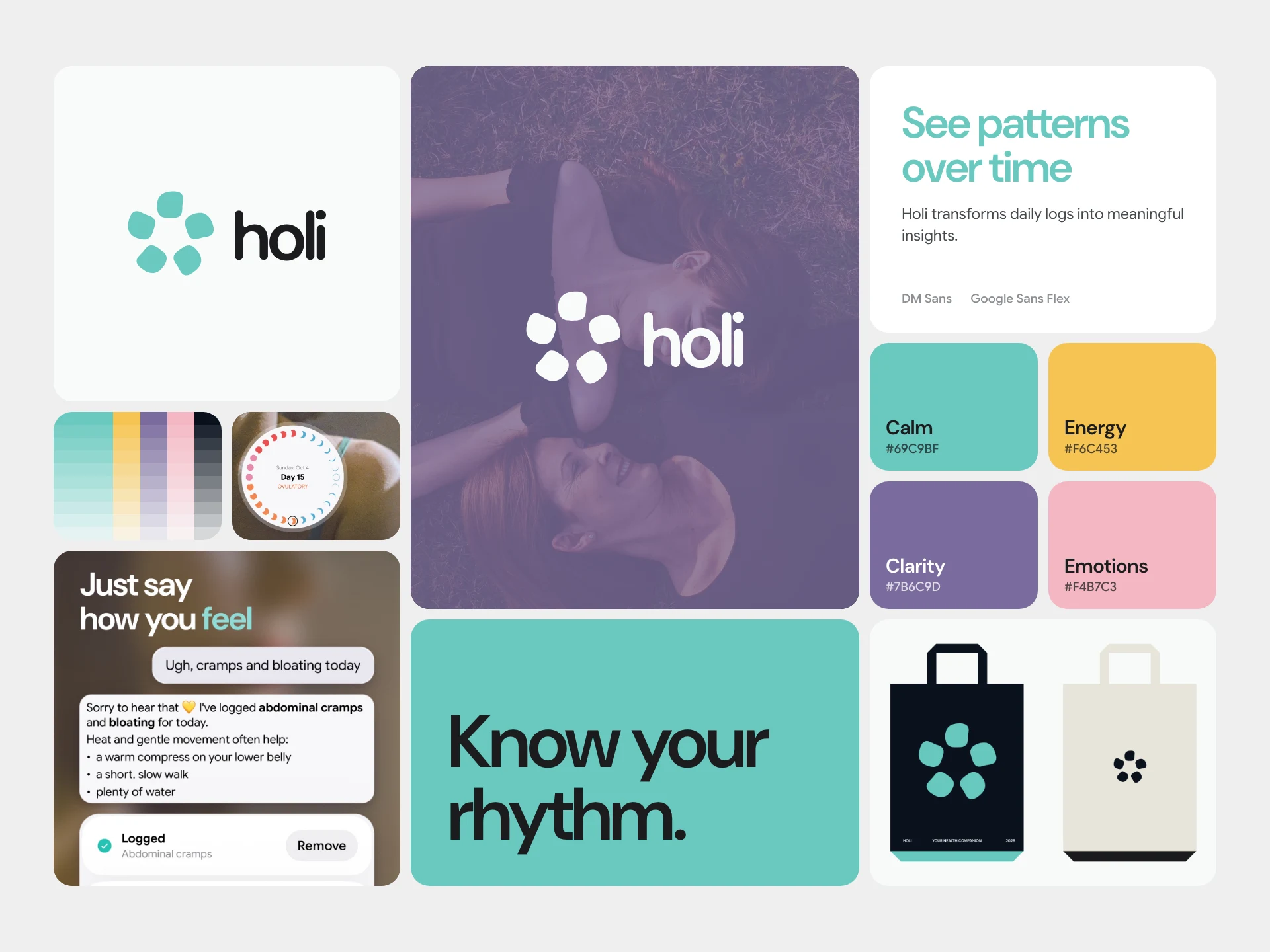
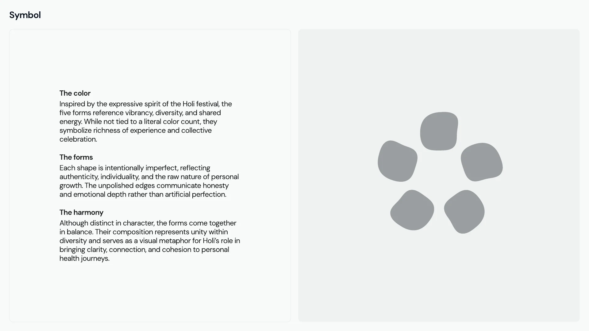
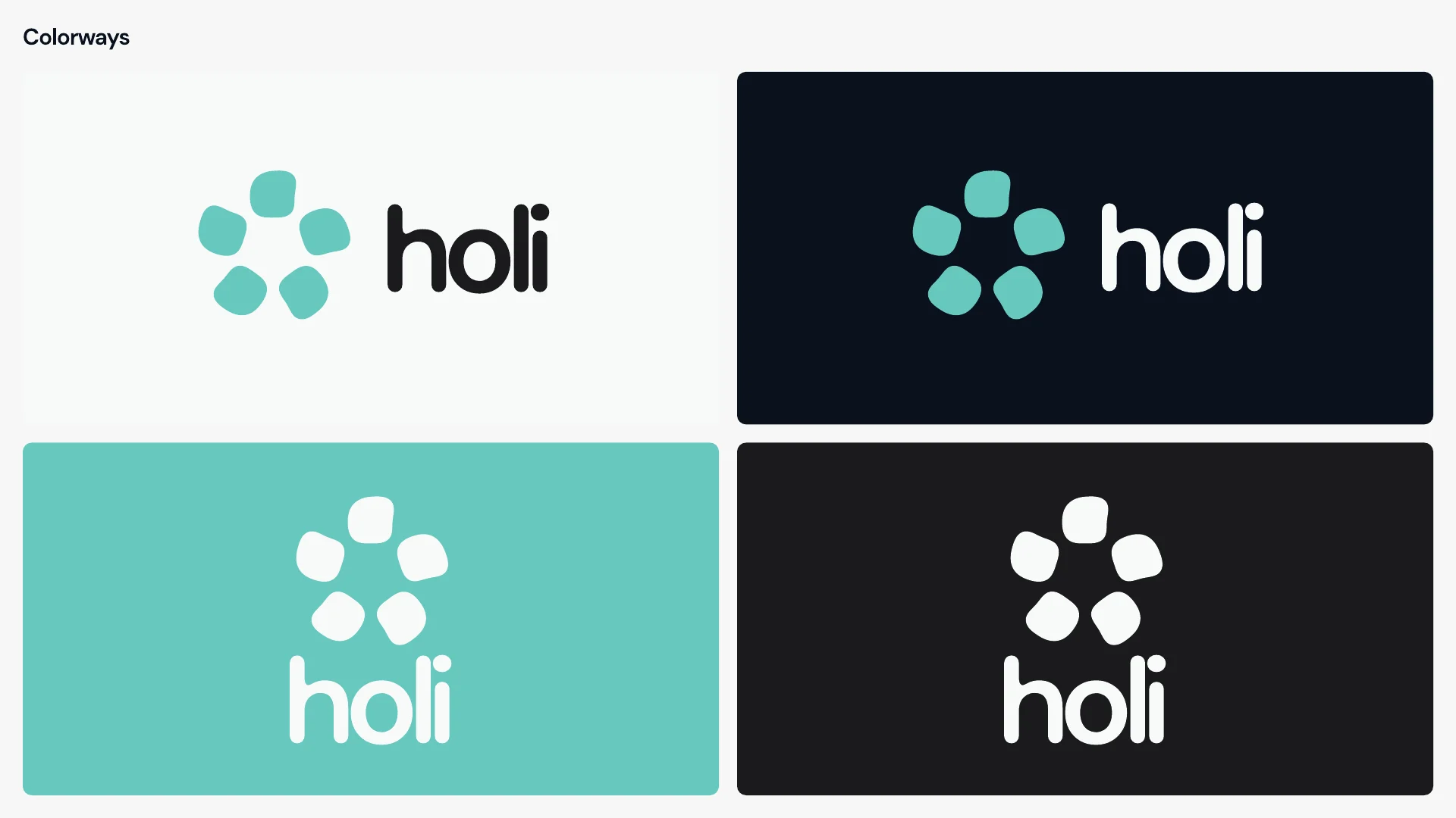
The name comes from Holi, the festival of colour. The symbol is five rounded forms in a ring. Each form is slightly uneven on purpose, so the mark feels personal, and together they balance as one.
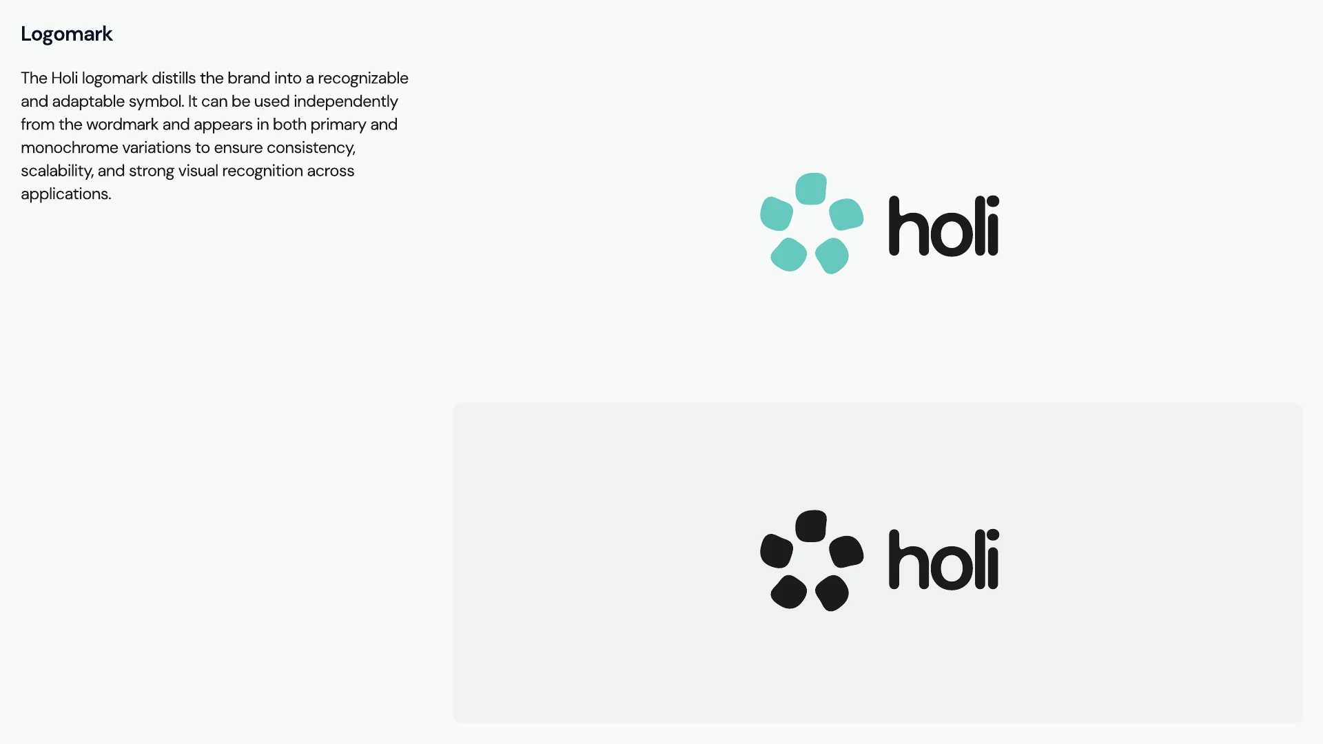
The wordmark is lowercase, with rounded ends like the forms. Besides the colour version, the logo works in black and reversed out of aqua or dark backgrounds. The symbol stands on its own as the app icon and the avatar.
Colour
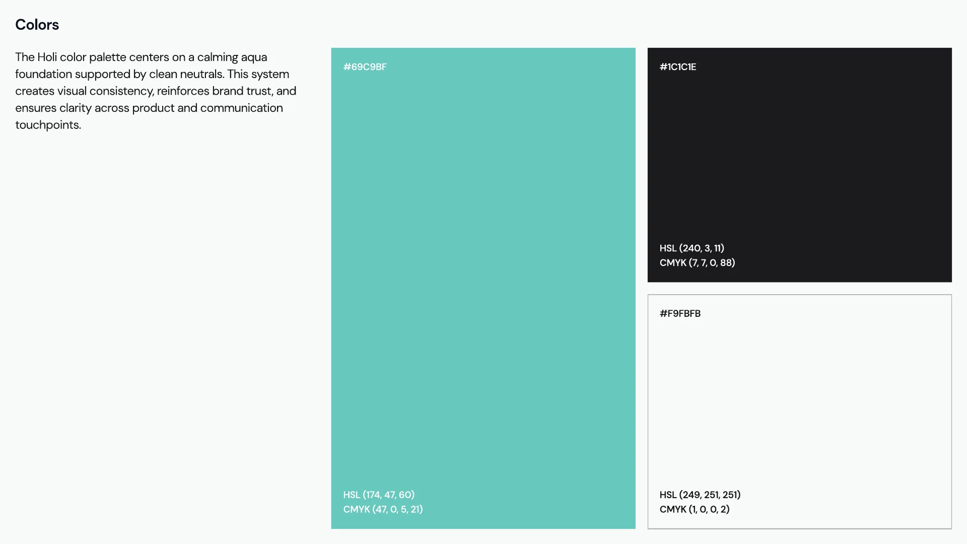
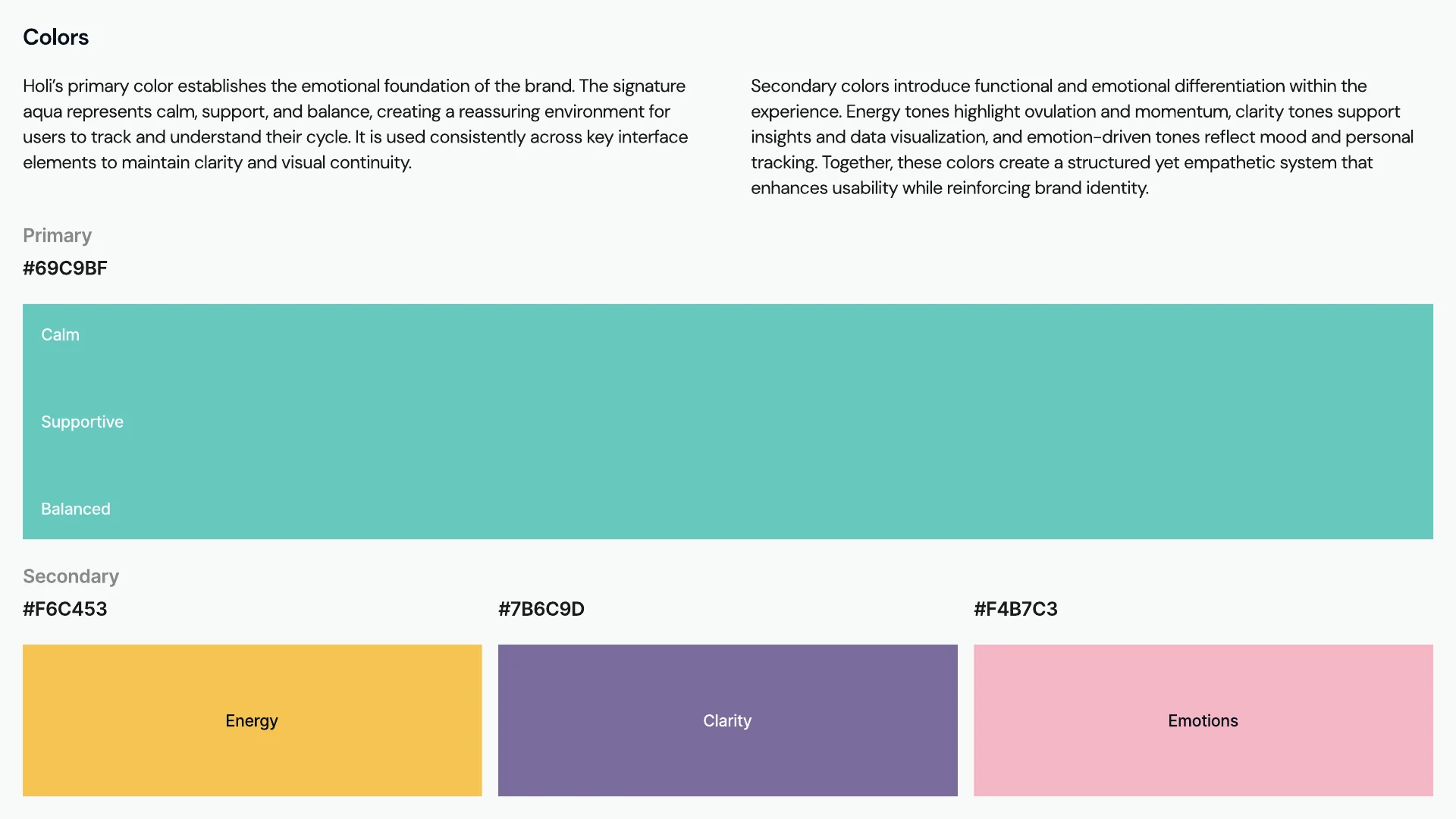
Holi's colour is aqua, #69C9BF, with a near-white and a near-black beside it. Three secondary colours each have a job in the app. Yellow marks energy and ovulation. Violet carries insights and charts, and pink belongs to mood.
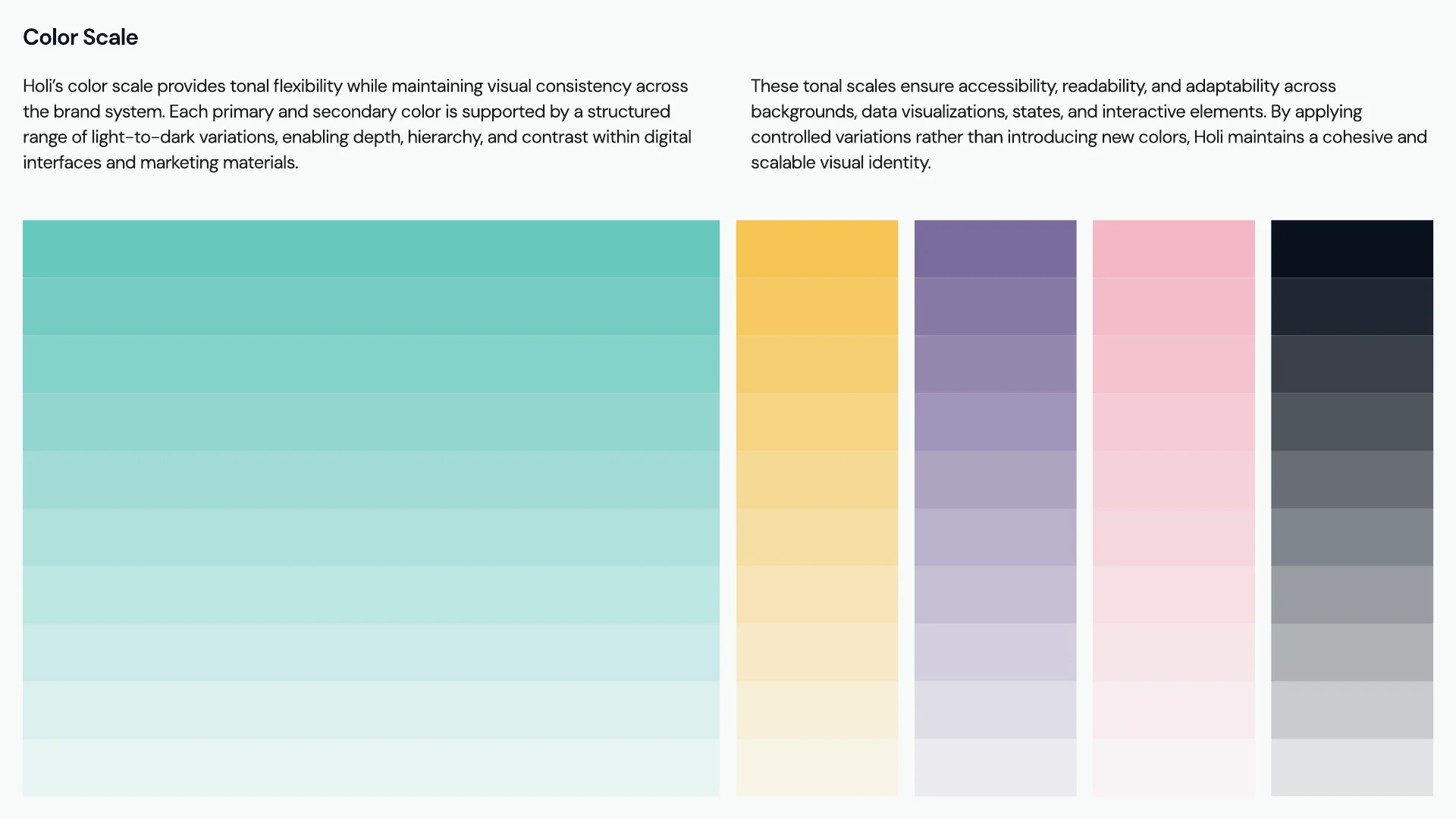
Every colour has a ten-step scale, so the app gets its states and depth without adding new colours.
Typography
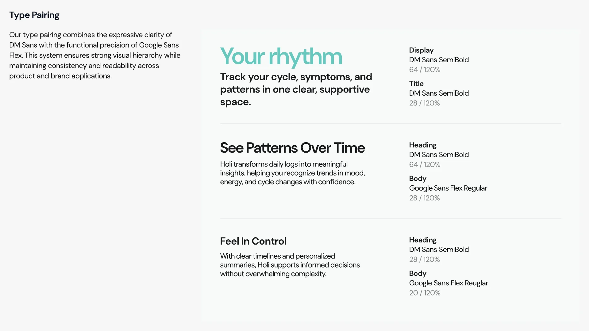
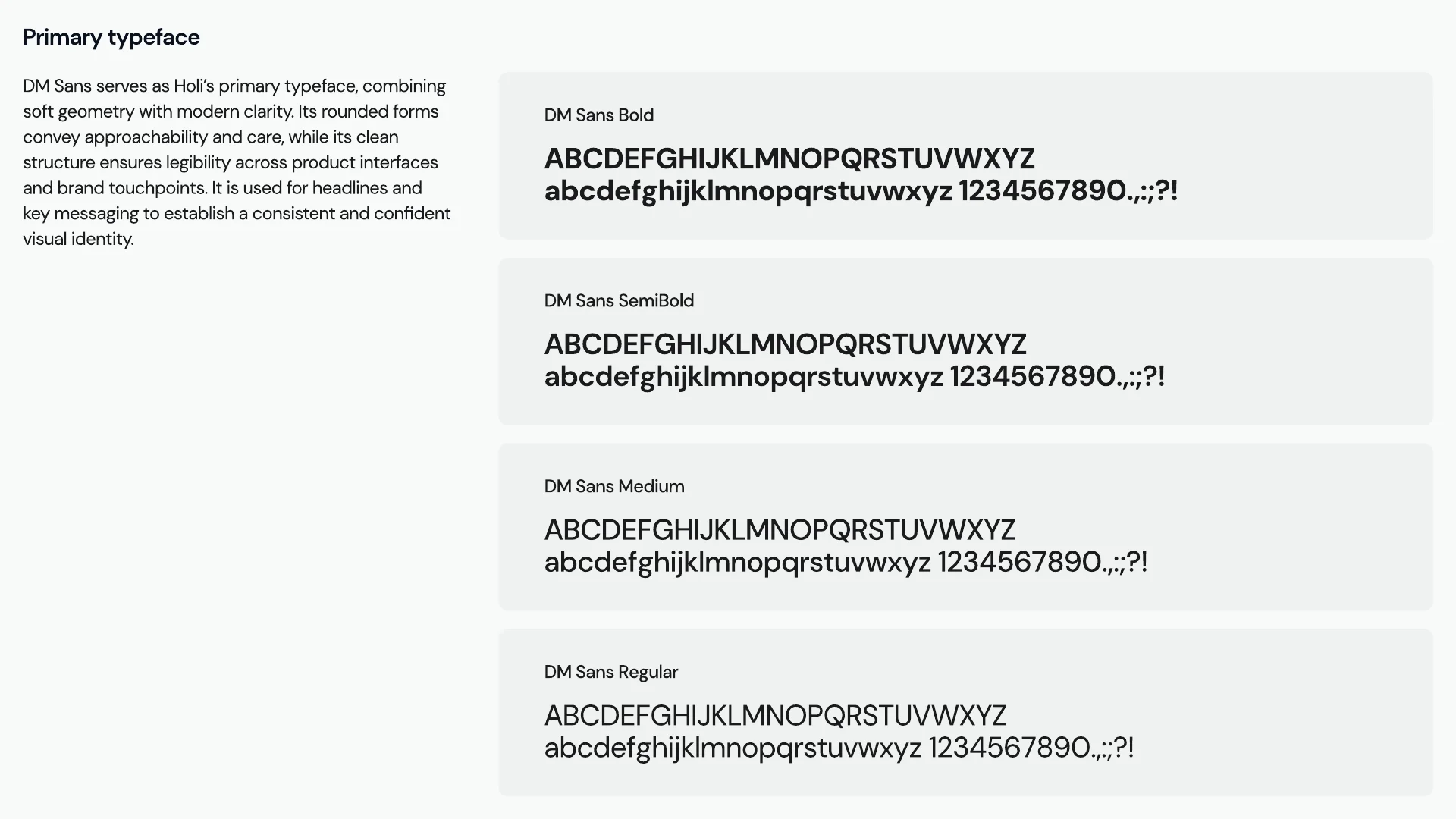
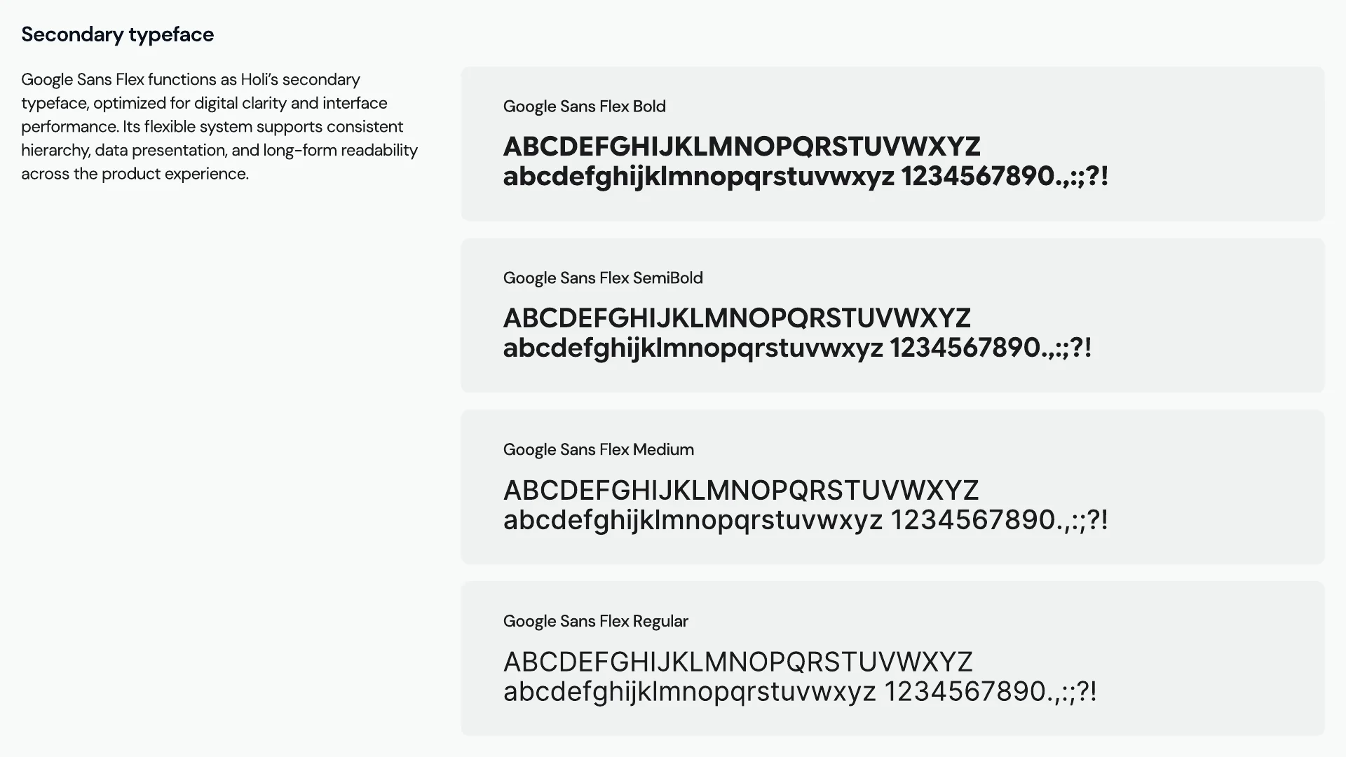
DM Sans sets the headlines, where its rounded geometry reads as warm. Google Sans Flex takes the rest of the interface, where text has to stay clear at small sizes.
In use
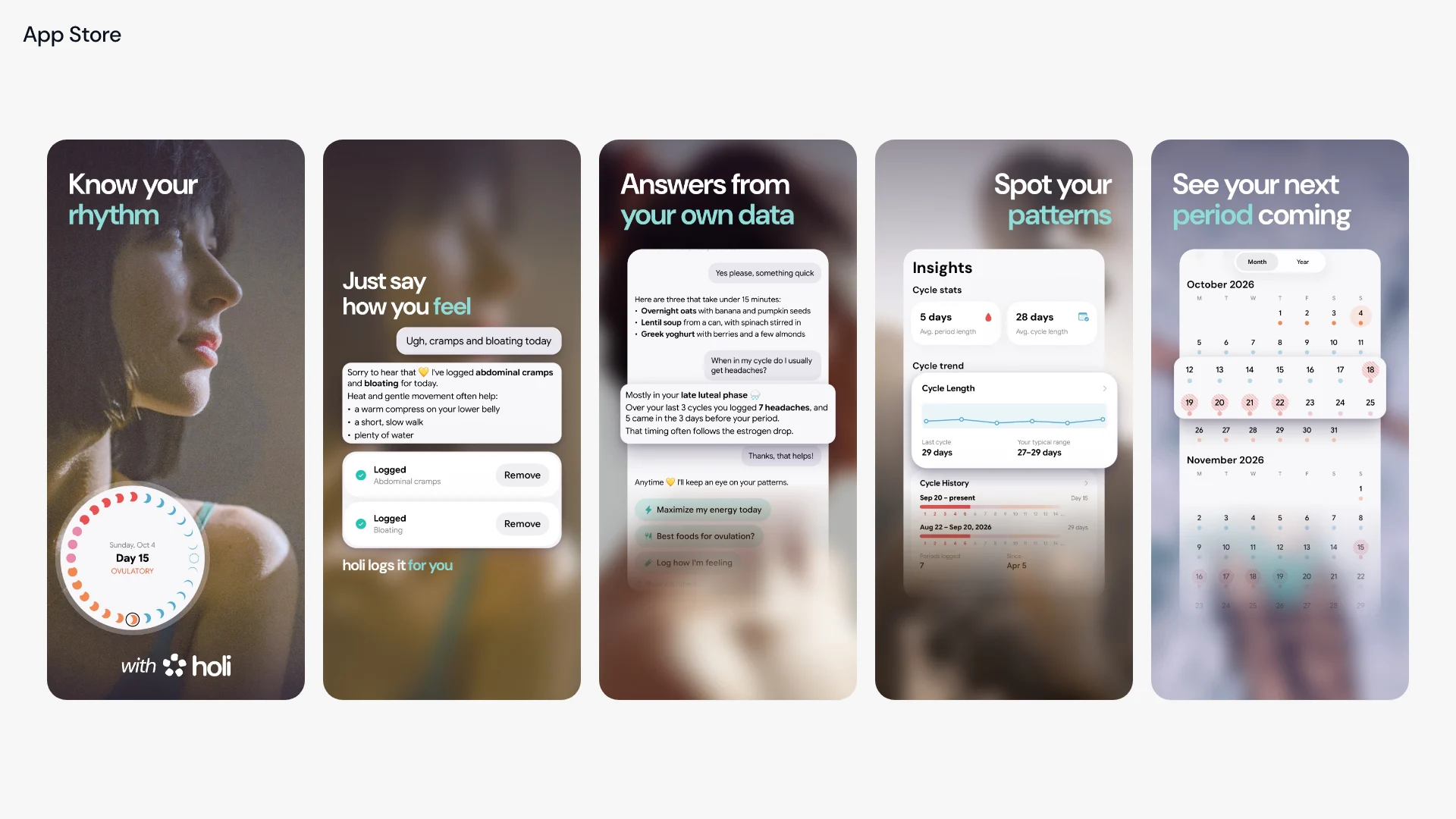
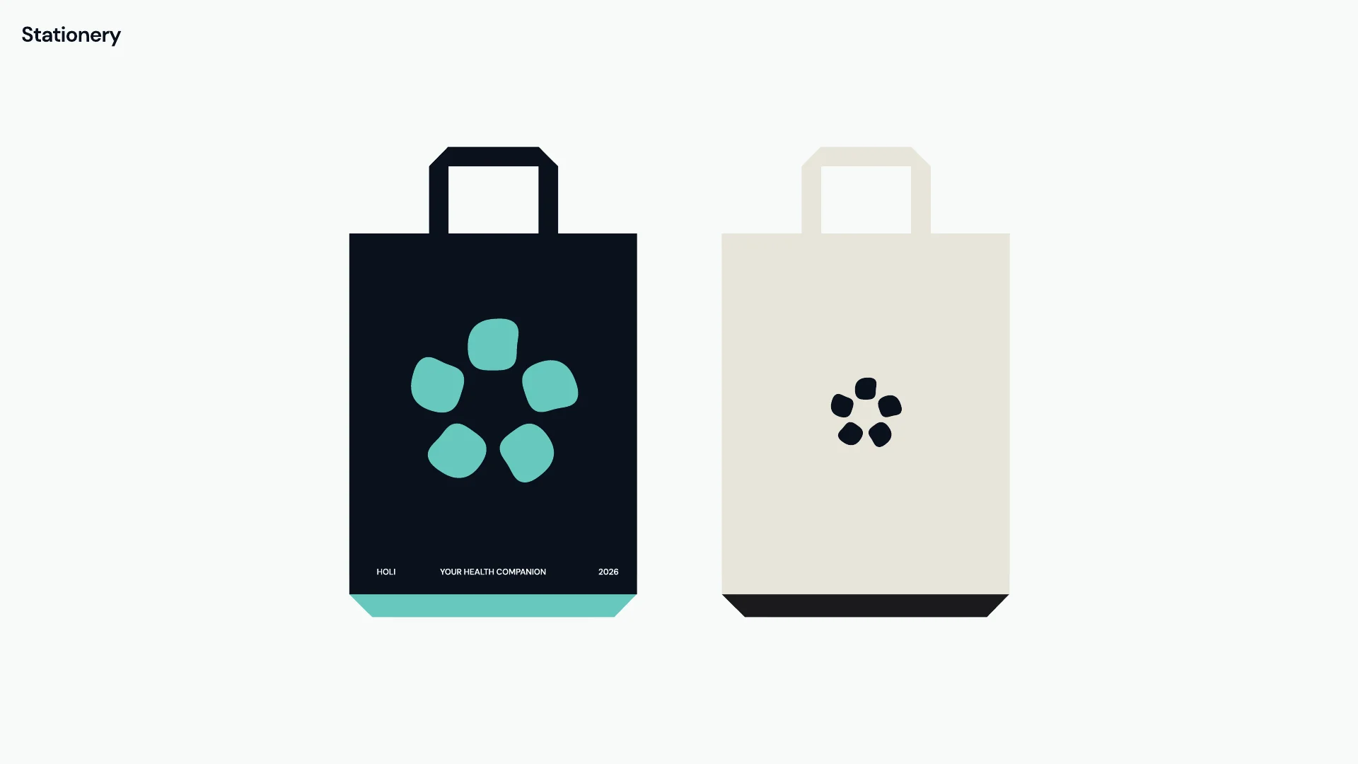
Holi's App Store screenshots use the brand type and the aqua accent. The symbol alone is the social avatar and the print on the tote bags.