Immuneed
Brand identity and design system for Immuneed: logo, typography, colour, iconography, charts and the guideline that holds them together.
Brand Designer
Role
Background
Immuneed is a contract research organisation in Uppsala. Its test system, ID.Flow, circulates fresh human whole blood with a drug candidate at 37 °C, so pharma and biotech teams can see human immune responses before first-in-human studies. The audience is scientists and non-clinical safety leads, and the channels that reach them are LinkedIn, scientific congresses and print.
I joined Immuneed part-time in August 2025 and have designed its identity and design system, from the logo to the guideline and the material that uses it.
Goals
One identity, every surface
Posts, slides, print and congress material should read as one company, whatever the week brings.
A visual language for scientific content
Readouts, cells and methods need pictures that carry meaning, so an explainer can show a point instead of only stating it.
Clear on a phone
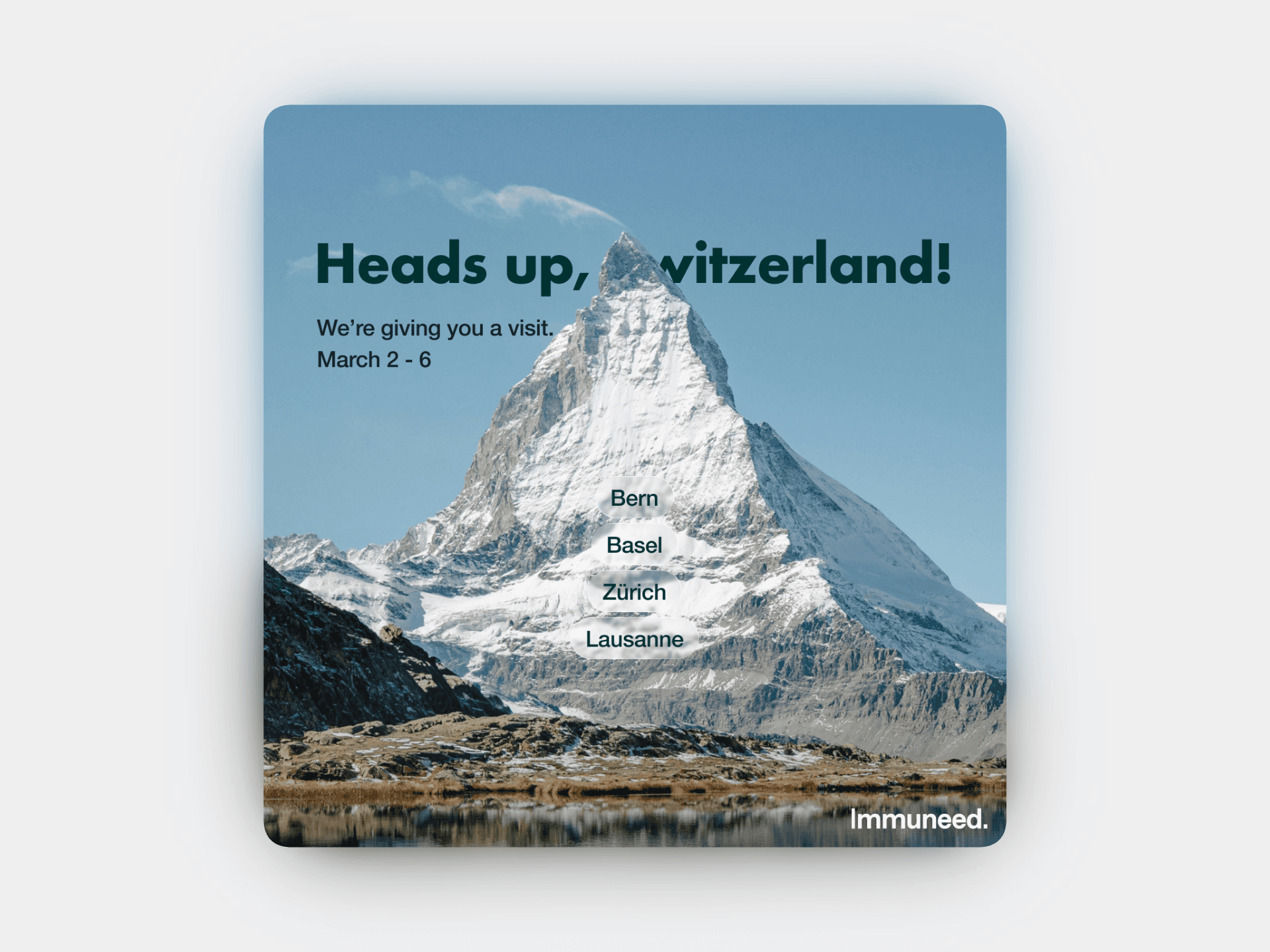
Most of the audience reads LinkedIn on a phone, so every piece has to hold at about a third of its size, with one idea per page.
The logo
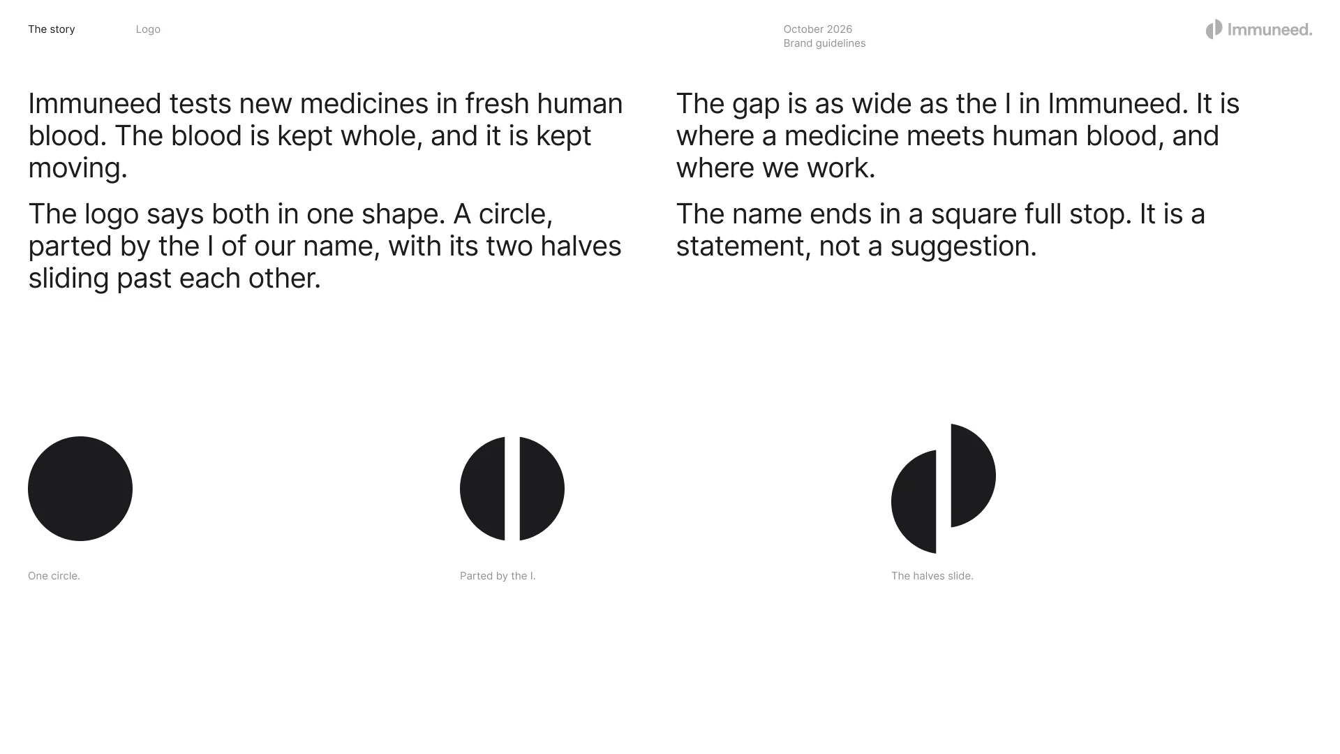
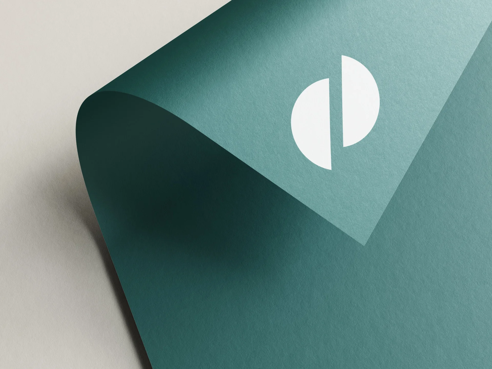
The symbol is one circle, parted by the I of Immuneed, with its two halves sliding past each other: the blood Immuneed tests is kept whole and kept moving. The gap is as wide as the I, so the mark and the letters are measured in the same unit, and the name ends in a full stop.
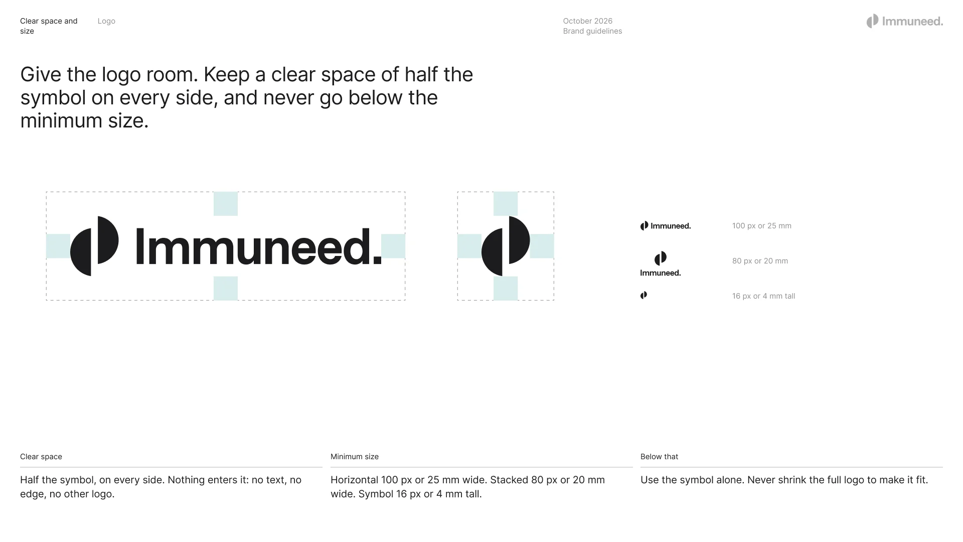
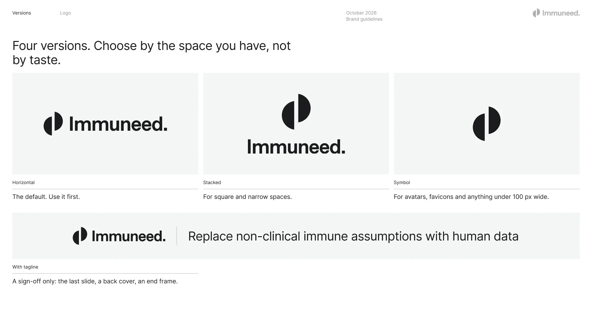
Four versions cover every space, chosen by the room available rather than by taste. The clear space is half the symbol on every side, and the horizontal logo never goes below 100 px or 25 mm.
Typography and colour
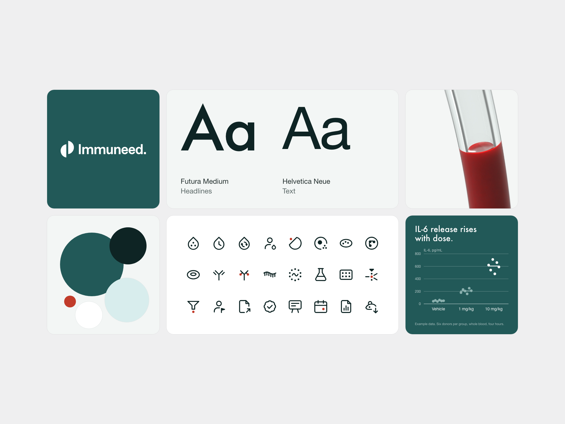
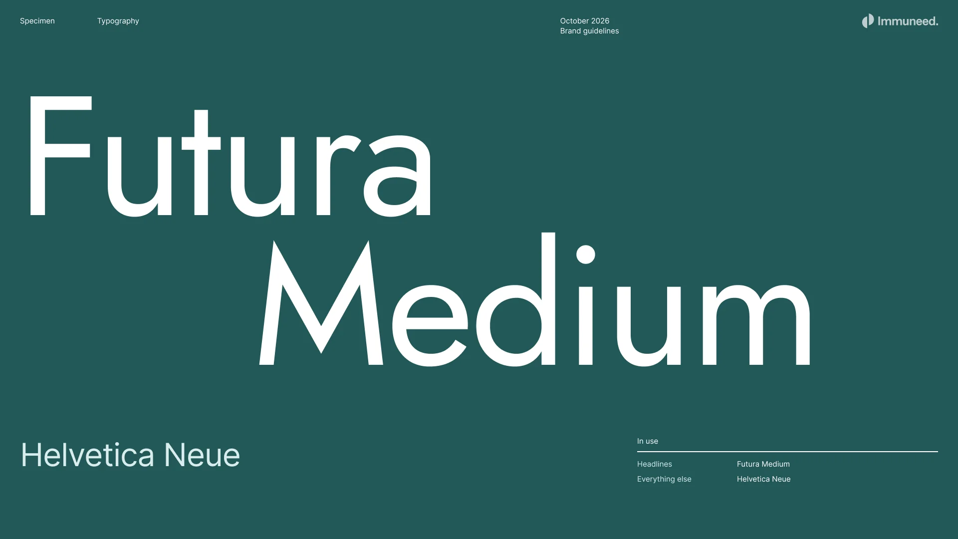
Futura Medium for headlines and Helvetica Neue for everything else. One scale for social images, measured on a 1080 canvas and scaled with the format; nothing is set below 28, because a post is read at about a third of its size in the feed.
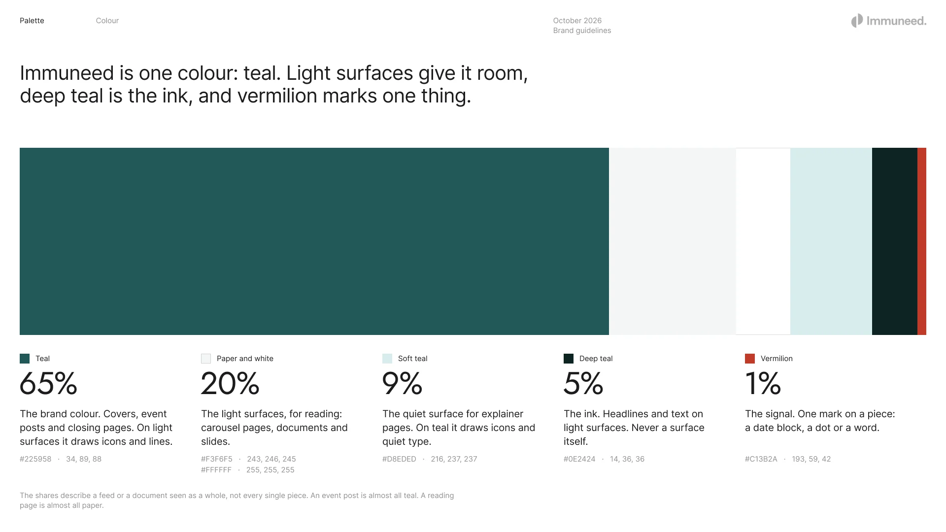
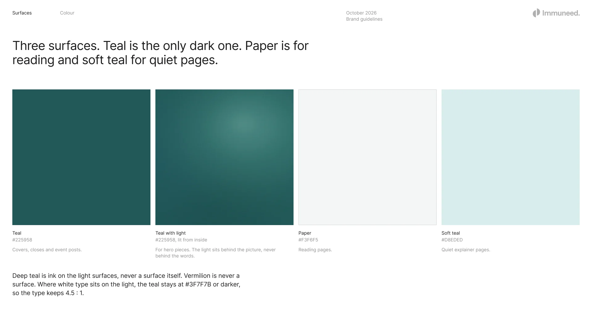
Immuneed is one colour, teal. Paper and soft teal give it room, deep teal is the ink on light surfaces, and vermilion marks one thing on a piece: a date, a dot or a word.
Iconography
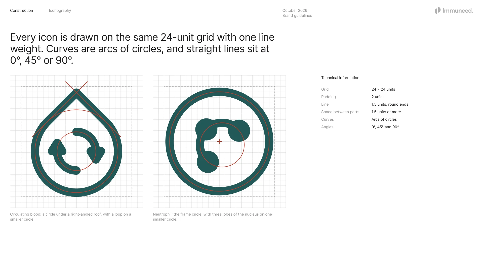
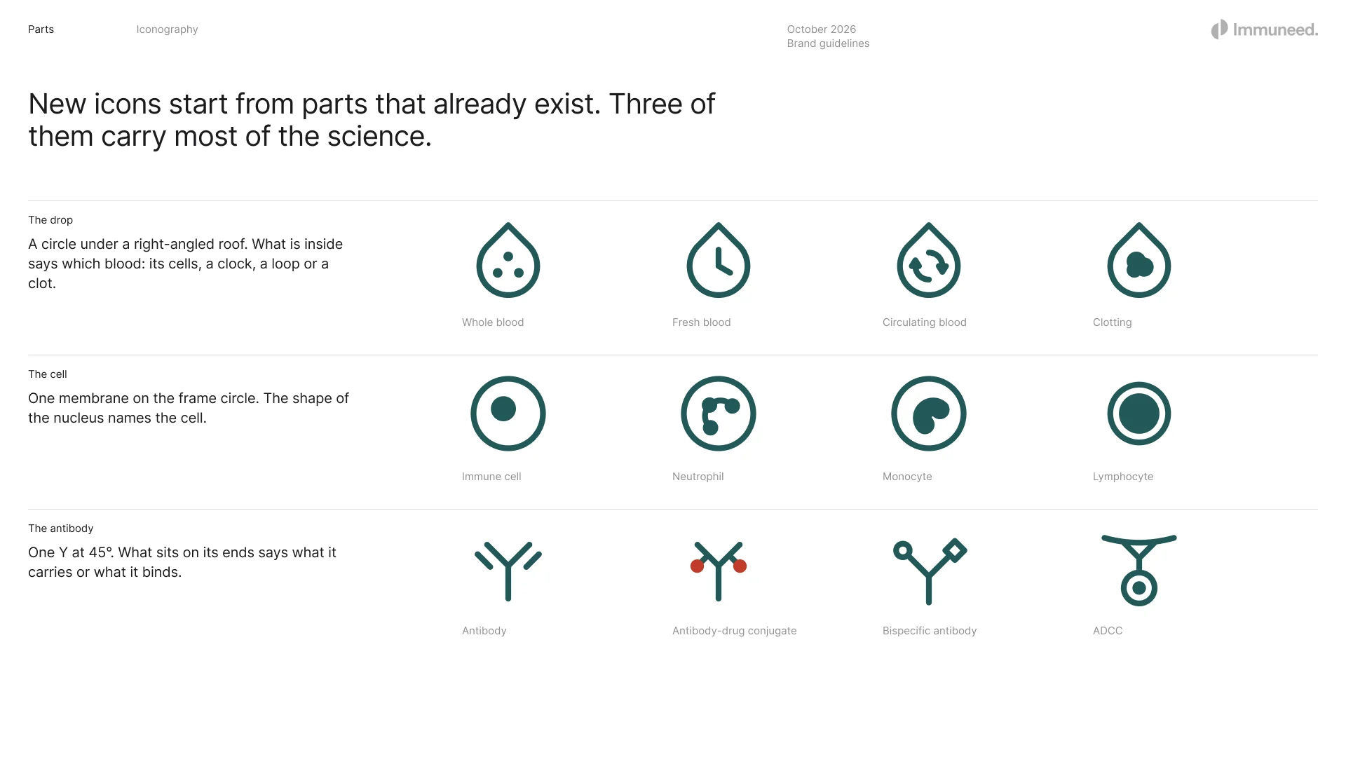
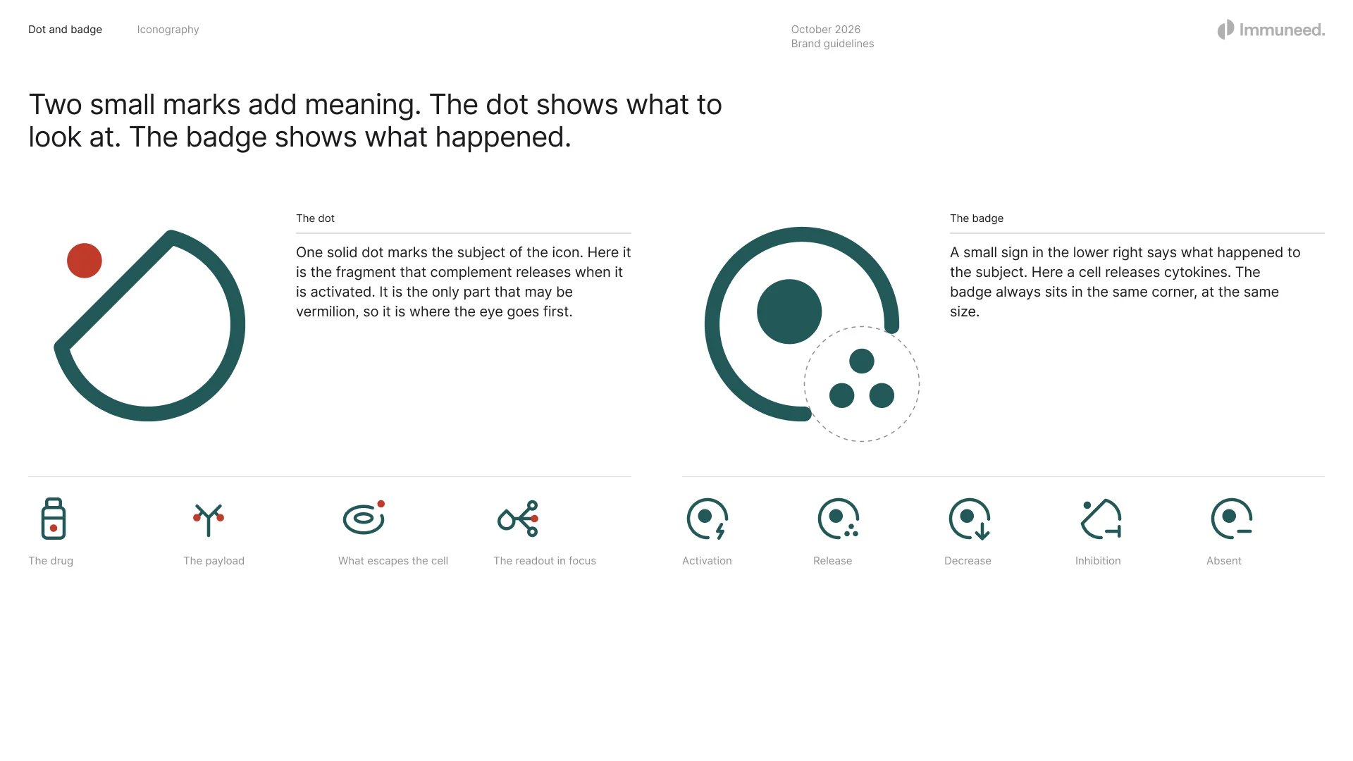
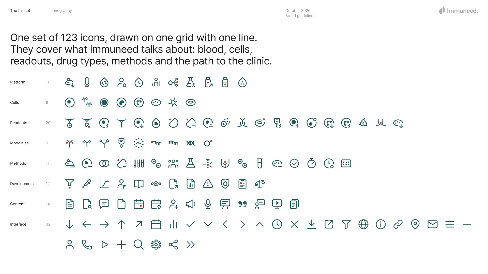
A set of 123 icons for what Immuneed studies: blood, the cells in it, what a study measures, the medicines it tests and the path to the clinic. Every icon is drawn on the same 24-unit grid with one line weight. Curves are arcs of circles, straight lines sit at 0°, 45° or 90°, and new icons start from parts that already exist: the drop, the cell and the antibody. Two small marks add meaning, a dot for what to look at and a badge for what happened.
Icons about science have to mean the right thing to scientists, so the icons under review go to the staff through a small rating page. Each person opens a link and rates how well every icon shows its idea, from 1 to 5. The scores decide which icons are redrawn.
Charts
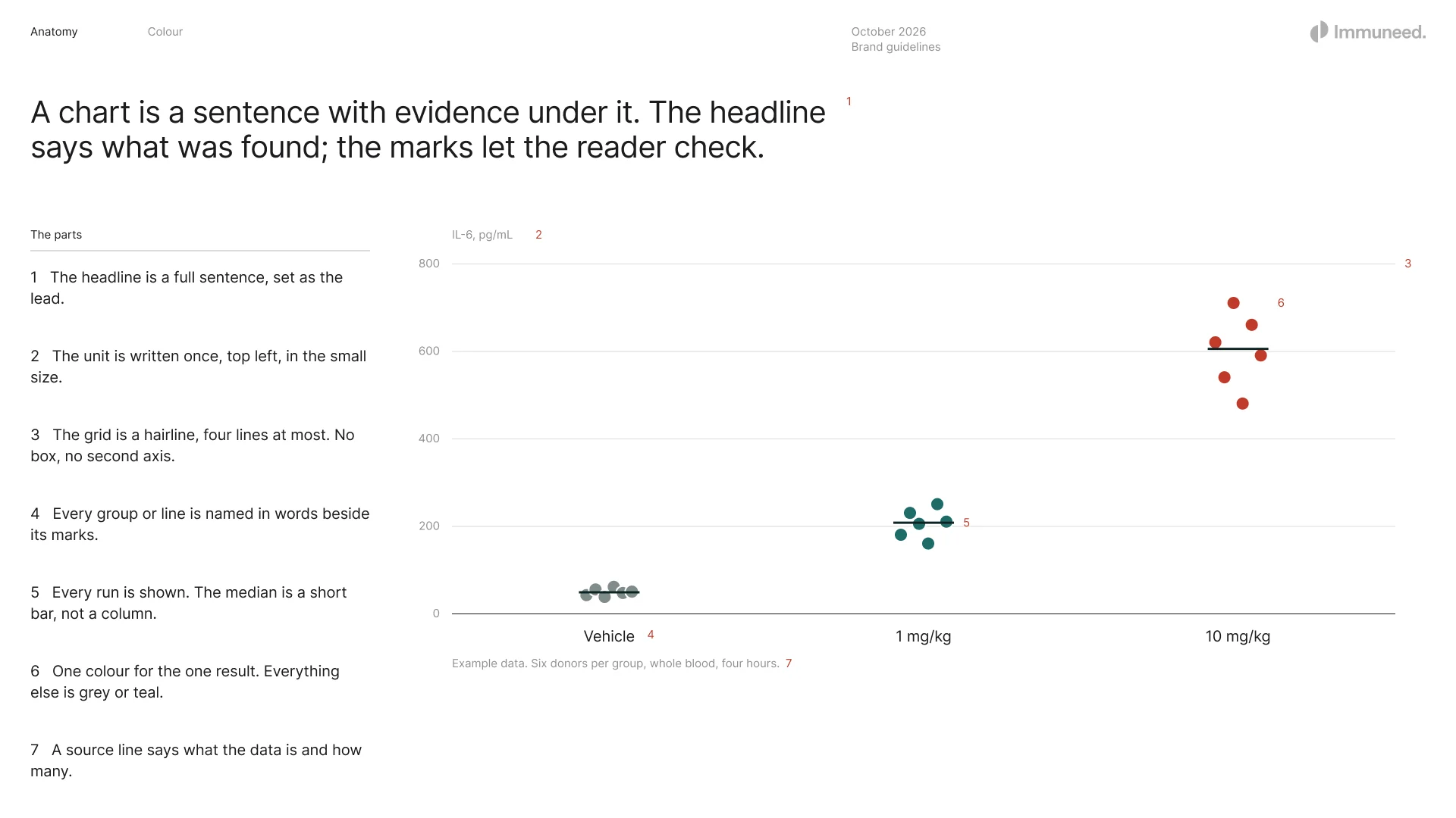
A chart is a sentence with evidence under it. The headline says what was found, every run is shown as a dot with the median as a short bar, the grid is a hairline, and one colour marks the one result the headline is about. On teal the chart keeps one quiet tint and white.
In use
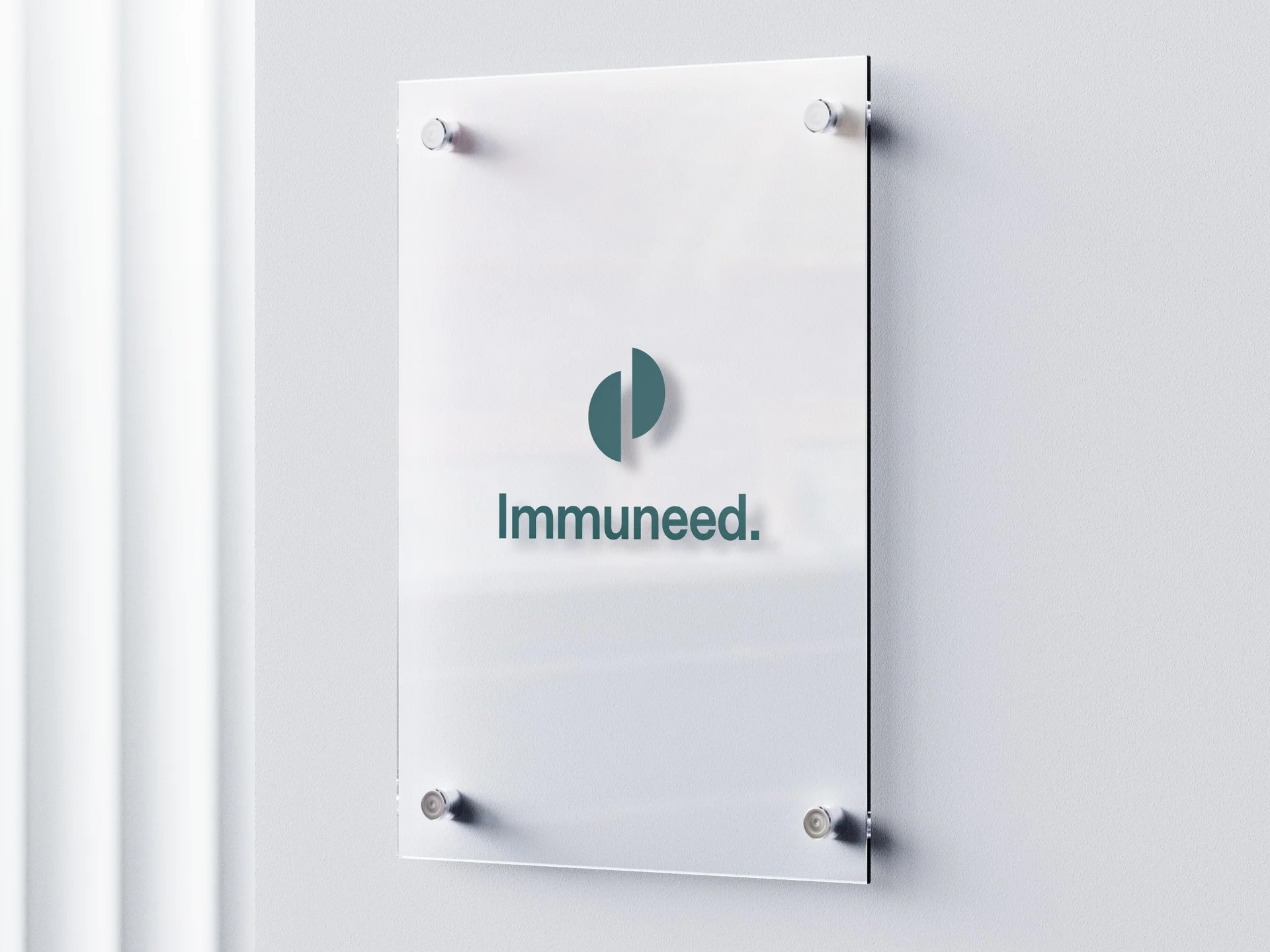
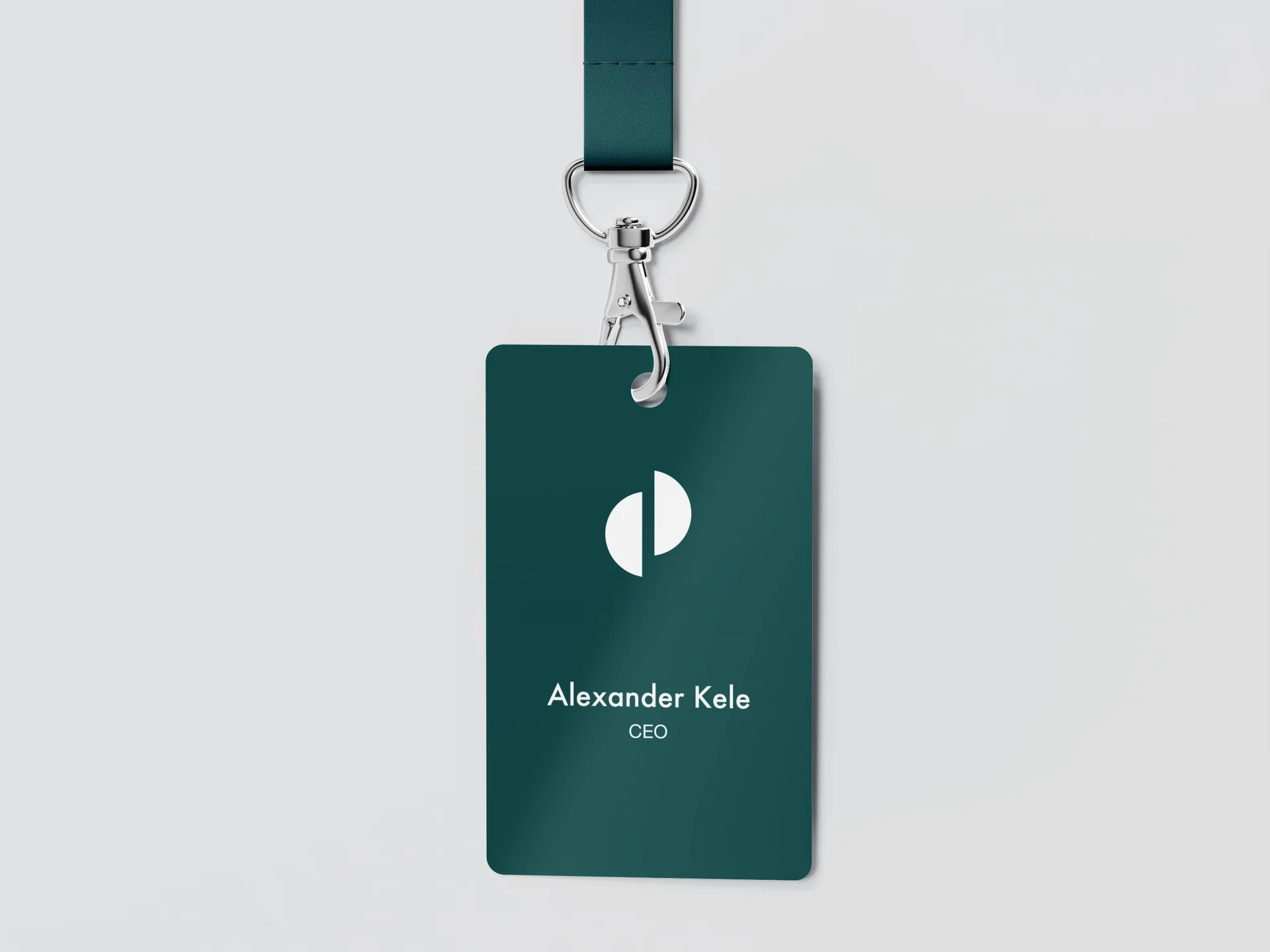
The identity applied to the room, signage, badges, stationery and print: one colour, the symbol alone where the name is already clear, and the logo on the margin with its clear space kept.

Tools
Figma
Blender
Adobe Illustrator
Adobe Photoshop
Adobe After Effects
Conclusion
Immuneed now has one identity across print, LinkedIn and congresses, written down in a guideline the team works from, and an icon system its own staff review before it is used. New work starts from the system rather than from a blank page.